
In today’s fast-paced digital world, connecting with your audience means reaching them wherever they are—on desktops, tablets, or smartphones. That’s where Responsive Newsletter Design comes in. It ensures that your emails look great and function perfectly on any screen size. A well-designed, mobile-friendly newsletter not only captures attention but also keeps your readers engaged, boosting clicks, conversions, and brand loyalty.
If you’ve ever wondered how to create a responsive newsletter, this guide will walk you through everything you need to know—from understanding its importance to learning the key elements of an effective design.
Why Responsive Newsletter Design Matters?
Your subscribers don’t all open emails on the same device. Some check messages on their laptops, others scroll through on tablets or phones. Without Responsive Newsletter Design, your emails might look fine on a computer but appear broken or unreadable on smaller screens.
Here’s why this type of design is essential:
Better user experience: A responsive layout adjusts automatically, so images, text, and buttons always display correctly.
Higher engagement: When your email is easy to read and navigate, readers are more likely to click your links.
Improved conversions: Clear calls-to-action (CTAs) encourage readers to take the next step—like making a purchase or signing up.
Professional image: A well-structured email reflects your brand’s credibility and attention to detail.
Simply put, if your newsletter isn’t responsive, you’re losing a big part of your audience.
How to Create a Responsive Newsletter?
Now that you know why it’s important, let’s explore how to create a responsive newsletter that stands out. You don’t need to be a tech expert—just follow these simple steps.
- Start with a Mobile-First Approach
More than half of all emails are opened on mobile devices. That’s why a mobile-first mindset is key in Responsive Newsletter Design. Begin your design process by ensuring that your newsletter looks perfect on smaller screens, then scale it up for larger ones.
Here are a few quick tips:
- Keep your layout single-column for easy scrolling.
- Use larger fonts for better readability.
- Make buttons big enough to tap with a finger.
- Keep paragraphs short and concise.
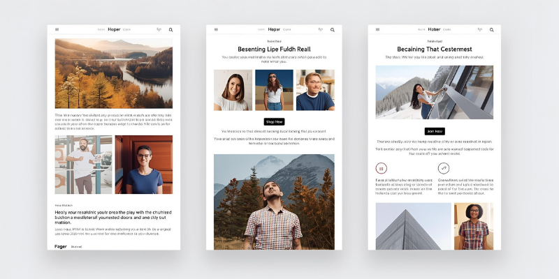
- Use a Responsive Email Template
The easiest way to build a newsletter is by using a pre-made responsive template. Many email marketing tools—like Mailchimp, Constant Contact, or Sendinblue—offer templates that automatically adjust to different screen sizes.
When selecting one, make sure it’s:
- Fully responsive across all devices.
- Customizable to match your brand’s colors and fonts.
- Lightweight and optimized for fast loading.
Using a professional template saves time and guarantees that your Responsive Newsletter Design will perform well.
Design Elements That Make a Newsletter Responsive
Creating a responsive layout isn’t just about scaling images or resizing text—it’s about how all elements work together. Here’s what you should focus on:
- Flexible Images
Images often cause display issues if not handled properly. Always use scalable images that resize according to the device’s screen. Avoid using large image files that slow down loading times.
Tip: Add “alt text” to each image. It helps readers understand your message even if the image fails to load.
- Readable Fonts
Small or fancy fonts can make reading difficult, especially on mobile devices. Stick to web-safe fonts like Arial, Verdana, or Helvetica. Use a font size of at least 14px for body text and 20px or more for headings.
- Clear Call-to-Action Buttons
A strong CTA is the heart of any newsletter. Whether you want your readers to “Shop Now,” “Learn More,” or “Sign Up,” make sure your buttons stand out. Use contrasting colors, short phrases, and plenty of white space around them.
- Simplified Layout
Too many sections or images can overwhelm your audience. A clean, simple layout enhances focus and improves readability. Limit your design to key elements—header, content, CTA, and footer.
Testing and Optimization
Even with the best Responsive Newsletter Design, you need to test your emails before sending them out. Here’s how:
- Preview across devices: Use email testing tools to see how your newsletter looks on mobile, tablet, and desktop.
- Check for broken links and missing images.
- Test loading speed: A slow email discourages readers from engaging.
- A/B test your design: Experiment with different layouts, CTAs, or images to see what works best.
Optimization doesn’t end after one send. Keep track of open rates, click-throughs, and conversions to fine-tune your design for future campaigns.
Best Practices for a Successful Responsive Newsletter Design
To ensure your newsletters always hit the mark, follow these best practices:
- Keep it short and simple: People scan emails quickly. Use short sentences and bullet points.
- Use contrasting colors: Make text and buttons stand out.
- Include white space: It gives your design breathing room.
- Avoid large blocks of text: Break them into smaller paragraphs.
- Add a plain-text version: Some email clients don’t support HTML.
- Always include a clear unsubscribe link: It keeps your email compliant and professional.
Consistency is key. Each email you send should reflect your brand’s tone, colors, and visual style while staying easy to read across devices.
Common Mistakes to Avoid
Even experienced marketers make mistakes when creating responsive newsletters. Here are a few pitfalls to watch for:
- Ignoring mobile users: Designing only for desktop screens can ruin the mobile experience.
- Using too many images: Heavy graphics slow down email load times.
- Not testing before sending: A design that looks fine in one inbox might break in another.
- Overloading with content: Too much text or visuals can distract from your main message.
Avoiding these errors ensures your Responsive Newsletter Design delivers a seamless and professional experience for every subscriber.
Conclusion
A well-crafted Responsive Newsletter Design isn’t just about aesthetics—it’s about connection. It allows your message to reach every reader in the best possible way, no matter what device they use.
By following the principles outlined above and learning how to create a responsive newsletter, you can design emails that are visually appealing, easy to navigate, and highly effective. Remember, your subscribers’ inboxes are crowded—make sure your message stands out for the right reasons.
With consistency, testing, and a focus on user experience, your responsive newsletters will not only capture attention but also drive real results for your business.